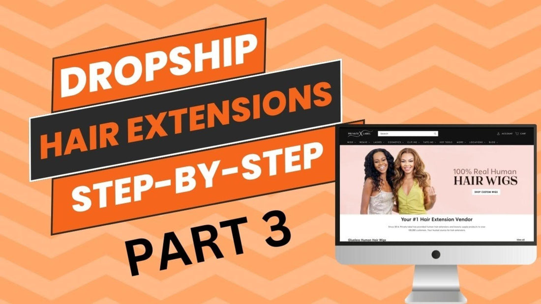
Building a Dropship Hair Extension Website Live Step-by-Step (Part 3)
Share
In the first blog of this series, we set up the website together with an outlook for Shopify settings.
In the second blog, we designed the pages and the blocks to elevate the experience.
In today’s blog, we are going to spice things up with an artistic edge.
As we covered most of the fundamentals, we will start to give your website a character that ultimately blends with your brand.
Let’s take our game to the next level.
Generating Images
I know a few of you might have tried Midjourney out of fun, but I adopted a little habit of depending on Dall.E.
It’s less complicated and more convenient.
I carefully craft my prompts to include everything.
That revolves around the brand name, the products, the goal, and the vibe.
For most of my imagery, I like the cinematic atmosphere with significant depth and thematic lighting.
I stress that in my prompt to get as close as I can to my desired output.
The first image you will need is a banner that appears once you open the website.
Don’t forget to tell Dall.M about the dimensions of your banner, so you don’t have to stretch it later.
Probably something around 1920x1080.
Depending on the collection number that you feature on the landing page, you’re going to need a couple of square pictures.
Or not a perfect square with an aspect ratio of 600x500.
You can use the same prompt with tiny changes to match the product.
Editing and Publishing Images
You can ensure the dimensions by making a canvas with the same ratios on Canva.
The trick is to lower the quality of the image when you download it.
Drop it down to 70%.
So, the image doesn’t take much time uploading which lowers your website performance, hence, your search engine ranking.
Save it as a JPG image for further optimization.
When you upload it to your website, remember to choose a focal point on the most important area, so it will be adaptable for any viewing conditions.
And add an Alt text, that’s useful for the search engine and people with visual problems at the same time.
It also helps to rename the picture with a meaningful name that represents the image’s content.
Adding Featured Collections
You should break down your website into sections that complement each other.
Featured products always look neat and lure the customer in.
To add a collection to the homepage, go to themes on your Shopify store, then customize, and then scroll down the left sidebar to add a section.
What you want to do though is ensure the products are swipe-able on mobile view, so they will not take rows and space off your website.
Designing Your Favicon
The favicon is the little icon that appears beside the website name in different browsers.
It helps to have one to make you look established.
The perfect sizes for it are 16x16 and 32x32. Shopify prefers the 32x32, so if you upload something bigger, it will scale it down to this size.
If you have a bulky logo, you might need to minimize it to the most iconic element or feature without text.
Then make a canvas with the same size on Canva and download it as a transparent PNG.
If there is any wasted space above or below the logo, you can trim it up with tools like PicMonkey.
Then go to the theme settings on Shopify, head to the logo section, and upload it there.
Refresh the website, and voila, you’re looking cool.
Fonts & Effects
Always make sure your fonts are readable, don’t get too crazy with it.
The most famous brands use basic fonts as they value their content more.
Montserrat and Futura look bold and clean.
A little tip I’d like to do is apply an effect to the main banner.
It makes the image almost like a moving 3D picture.
It’s the ambient movement in the image behavior dropdown.
This feature is amazingly simple and powerful.
An additional cool animation you can apply is the hover effect vertical lift.
So, once you hover over a picture it pops up and makes the experience more interactive.
You can reach this one in the theme setting in the animation section.
Social Media Linking
Also, in the theme settings, you should update your social media buttons.
They’re predestined to Shopify social channels.
But be careful about driving your audience away from your website.
Google picks up these little indicators like when people leave your website and so on.
Adjusting Cart Drawer
There are different styles to show your cart, like a drawer, a page, or a pop-up notification.
You can adjust the color scheme too.
The key point to focus on is not disturbing your customers with too much contrast.
Or to kill the attention span and make her go back and forth between pages.
Optimizing Check-Out Page
Shopify always ignores your logo on the check-out page.
Every time I need to reupload it.
Just make sure to center it and make it small so it doesn’t push your content down.
You might like to pick a color for the background.
If you did make it consistent with your brand or some fresh color to urge closing the sale.
In the next blog, we will dive into the product you will be selling.
Create your beauty brand custom logo now.